The problem
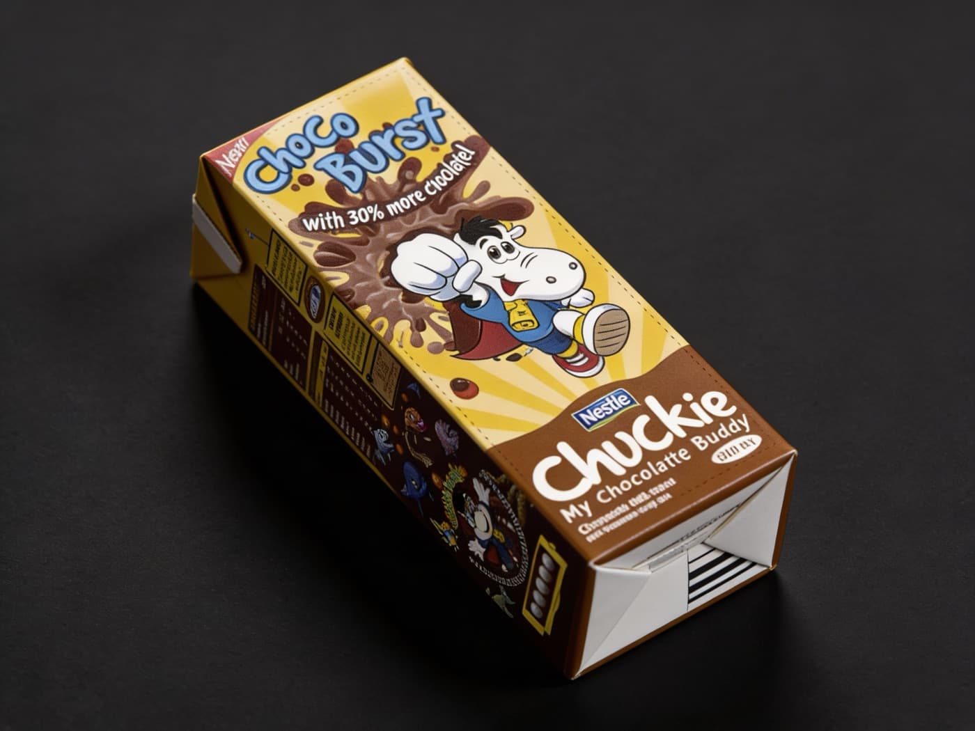
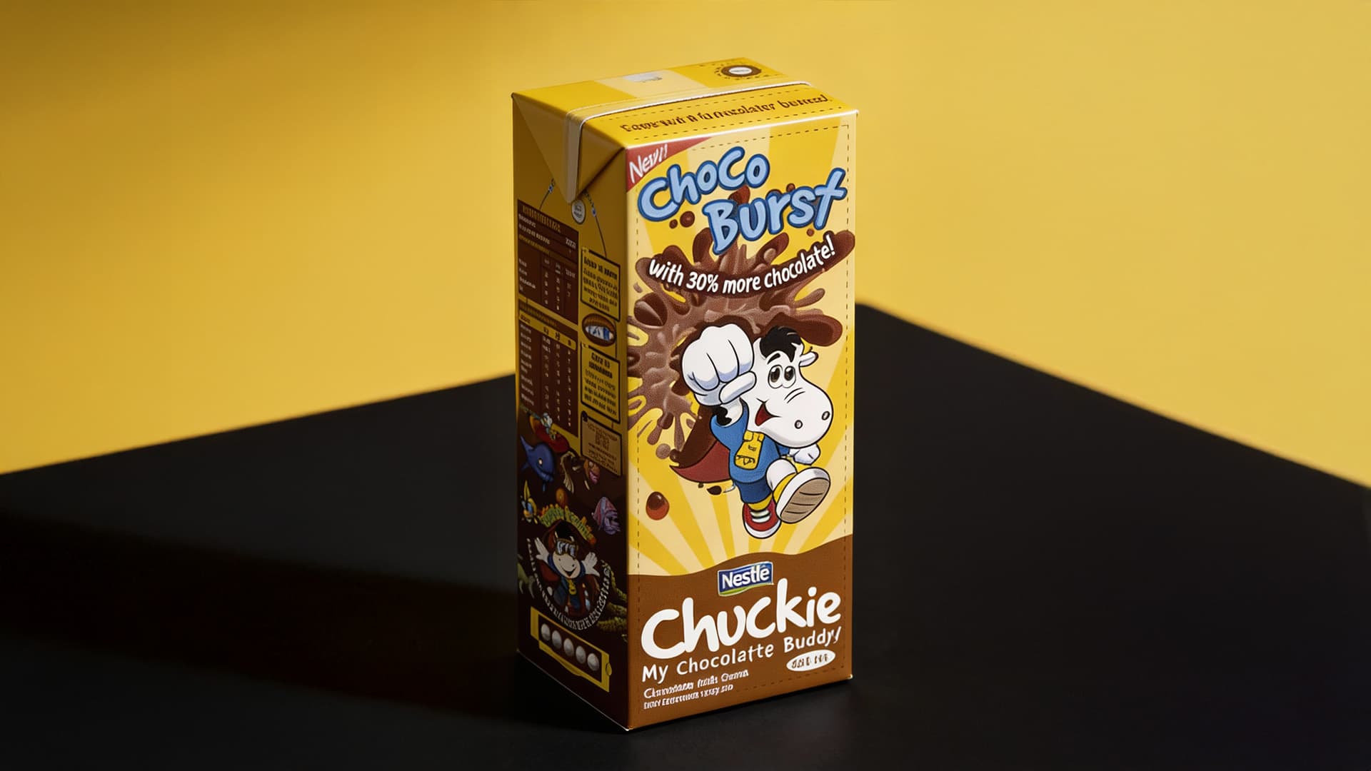
Chuckie was invisible on shelf, not failing, just lost in a wall of brown. Every competitor had converged on the same color. I was the art director on the account at McCann, running 360-degree campaigns for Coca-Cola, Unilever, and Globe Telecom at the time. I walked the aisle myself and found the real brief nobody handed me: nothing on that shelf was ownable.
What I did
I pitched the opposite of brown: predominantly yellow, loud enough to be the one thing that didn't look like everything around it. The room hated it. Brown felt safe, yellow felt like a firing offense if it flopped, but I held the position and got the sign-off by showing them exactly which shelf they'd be standing next to.
What happened
The redesign took the shelf. Competitors started copying the yellow; Nestlé sent cease-and-desist letters to stop them. The packaging is still running today, unchanged, 20 years later.
Why it matters
Everyone in that room had a reason to say no. I had one reason to say yes: the shelf actually got looked at, and they hadn't. That's still how I work.