The problem
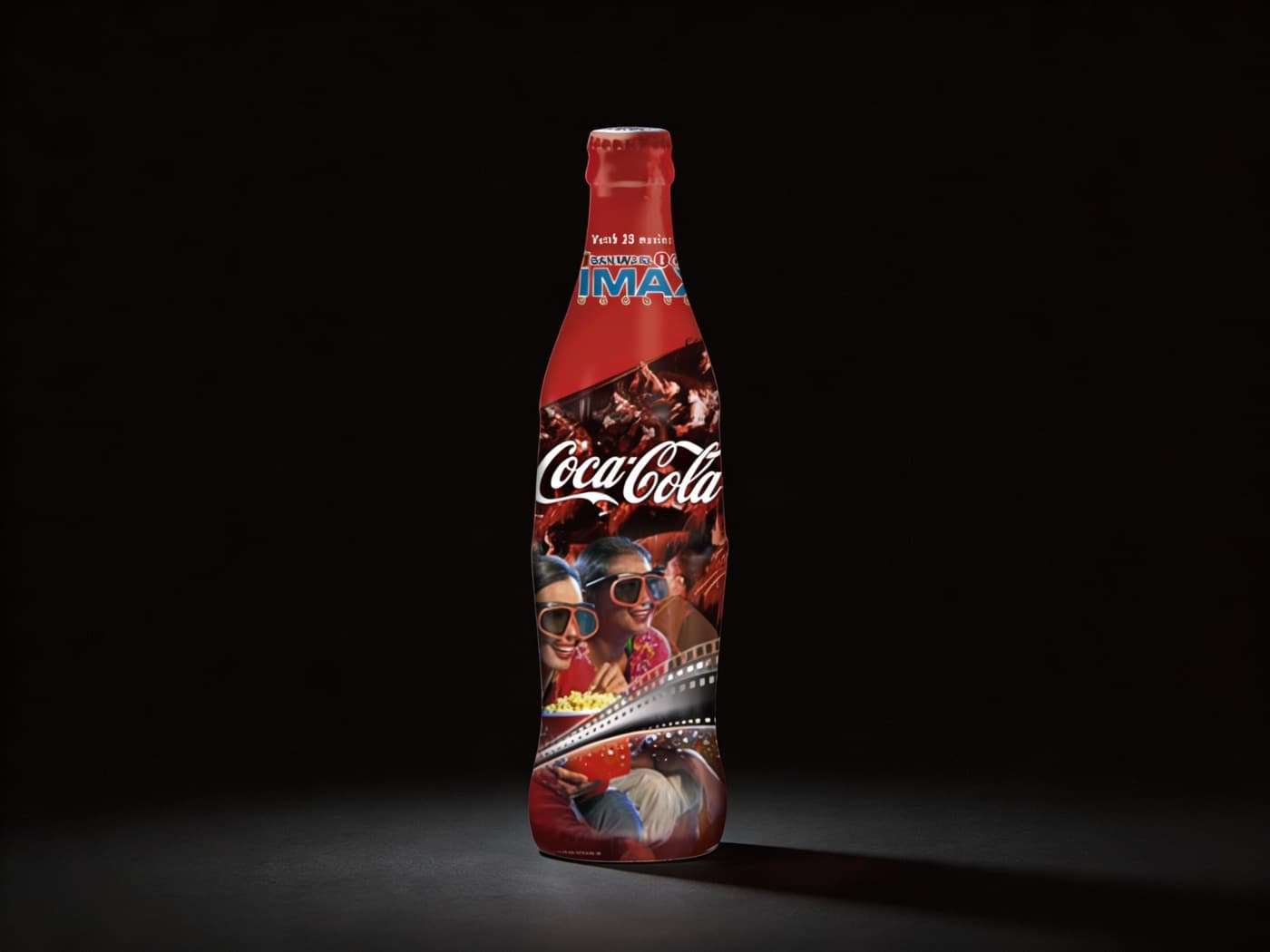
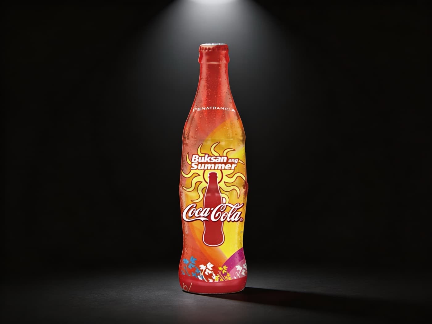
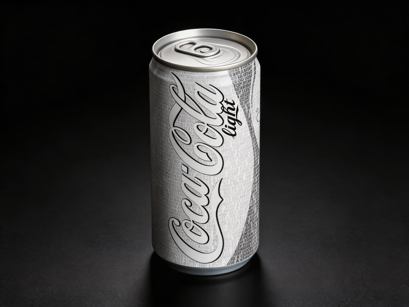
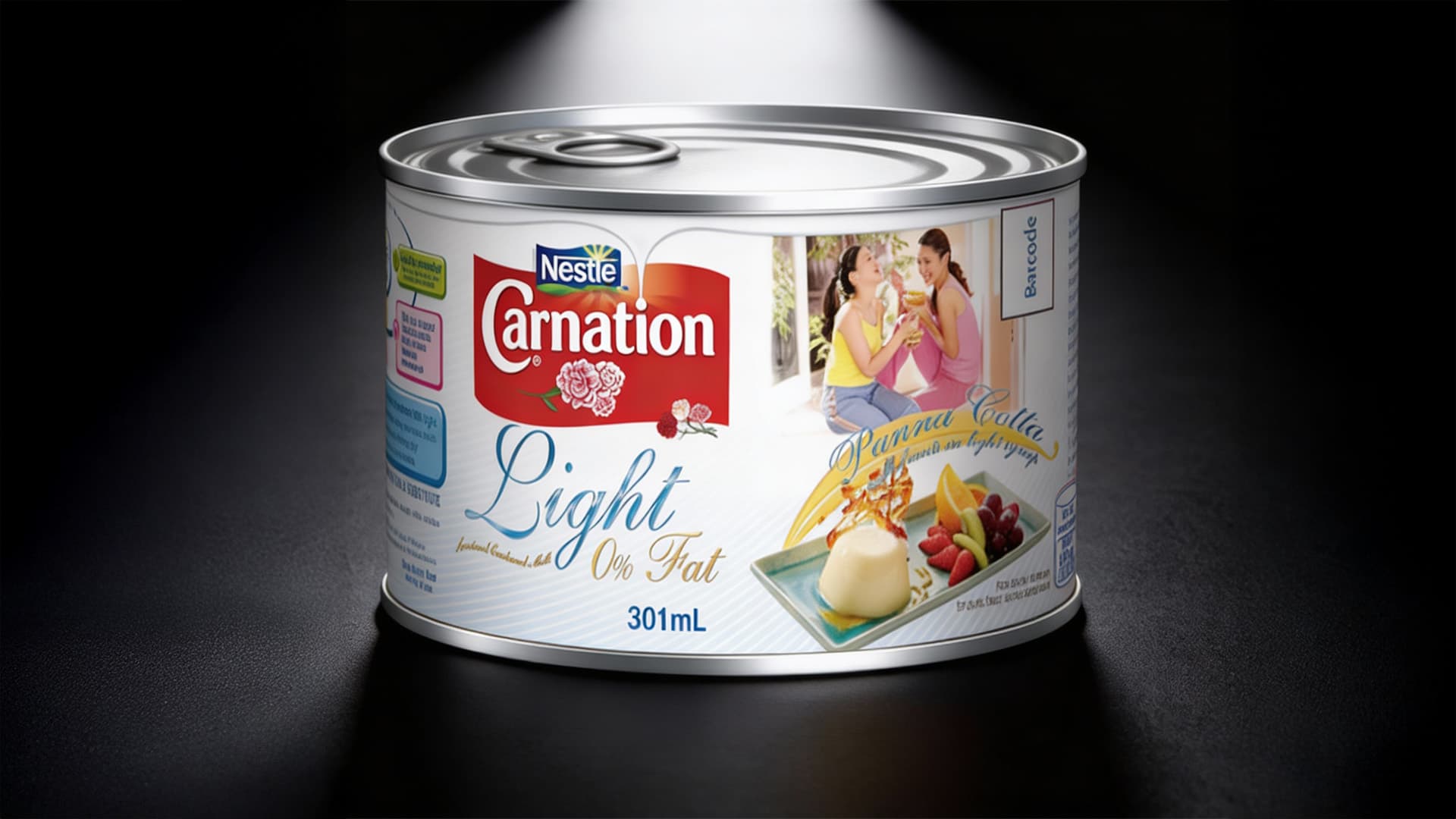
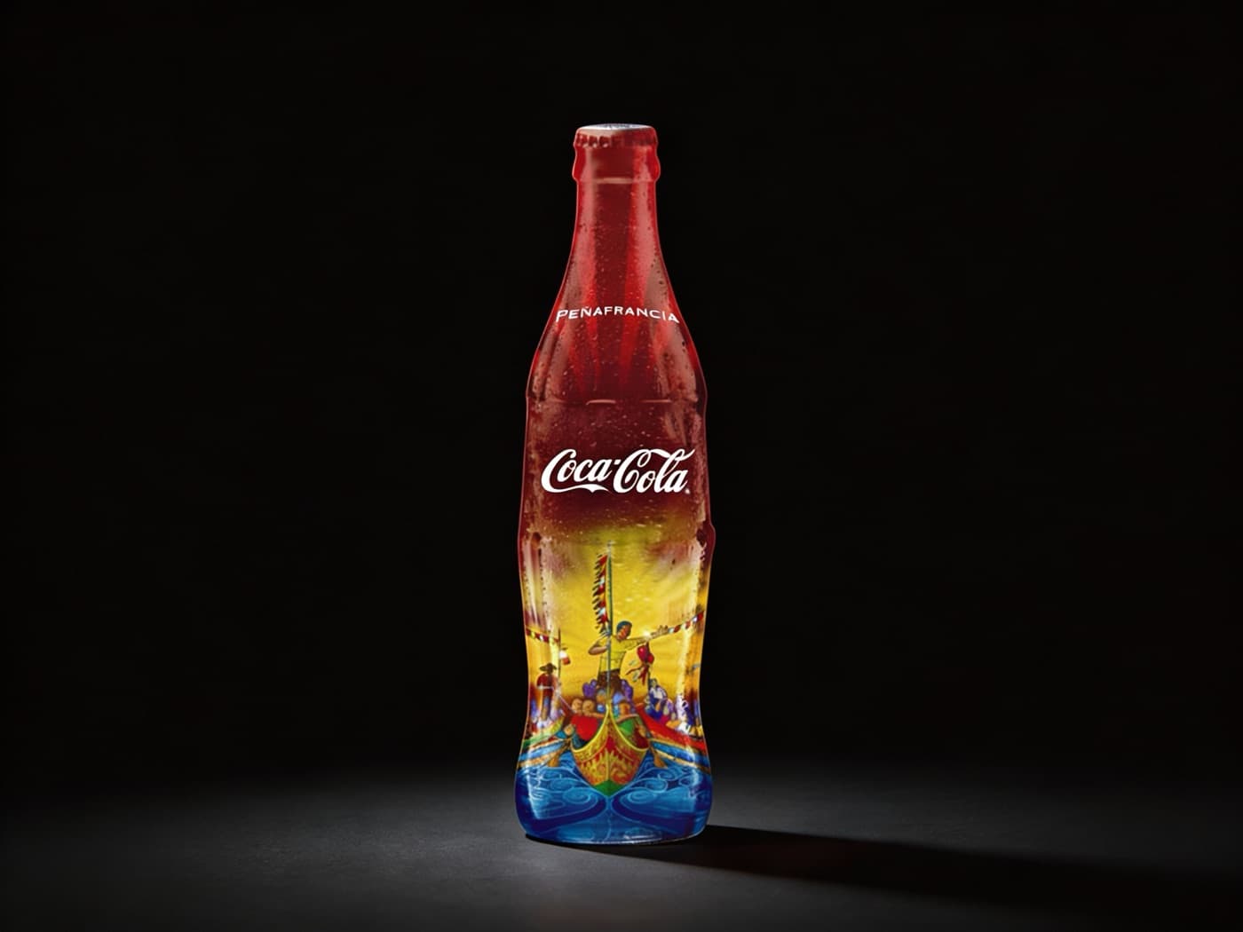
I ran Coca-Cola's limited-edition packaging program at McCann, and it wasn't one creative problem, it was a new one every few weeks. An IMAX anniversary tie-in. A Peñafrancia festival bottle. A summer push. A diet reformulation that needed its own visual identity. Different audience, different occasion, different emotional register every time, and every one still had to read as Coca-Cola first. I hit the same problem on Nestlé's Carnation line: a 'Light' evaporated milk variant that had to look like a real reformulation, not a diet sticker on the same can.
What I did
I locked a set of anchors, the script, the red, the bottle silhouette, and never let them move. IMAX got a film strip, 3-D glasses, popcorn, red on red, so the script stayed the loudest thing on the can. Peñafrancia went the opposite way: illustrated, warm, rooted in the actual festival, but I still anchored it back to brand red. Buksan ang Summer leaned into color and a sunburst mark instead of photography, cheap to reproduce and unmistakably seasonal. For Coca-Cola Light I built the pattern from the brand's own product language, so the diet variant didn't read as an afterthought. Carnation Light kept the red Nestlé lockup exactly where shoppers expect it and let the photography sell the reformulation.
What happened
Every one of these shipped as a real production release, not a pitch deck. I carried the same discipline across Unilever, Globe Telecom, and San Miguel Beer during the same run at McCann.
Why it matters
Say something new every time. Protect the one thing that has to stay constant. That's the discipline everything since traces back to, and I run the same check now on AI-generated creative, just with a different production method underneath it.